

• Overview
Earshot Jazz Festival is a month-long festival that takes place throughout Seattle during the months of October and November. The festival started in 1989 and has grown to include over fifteen venues in the Seattle area. The event honors the heritage of jazz while supporting the current creativity of local jazz artists.
The Problem
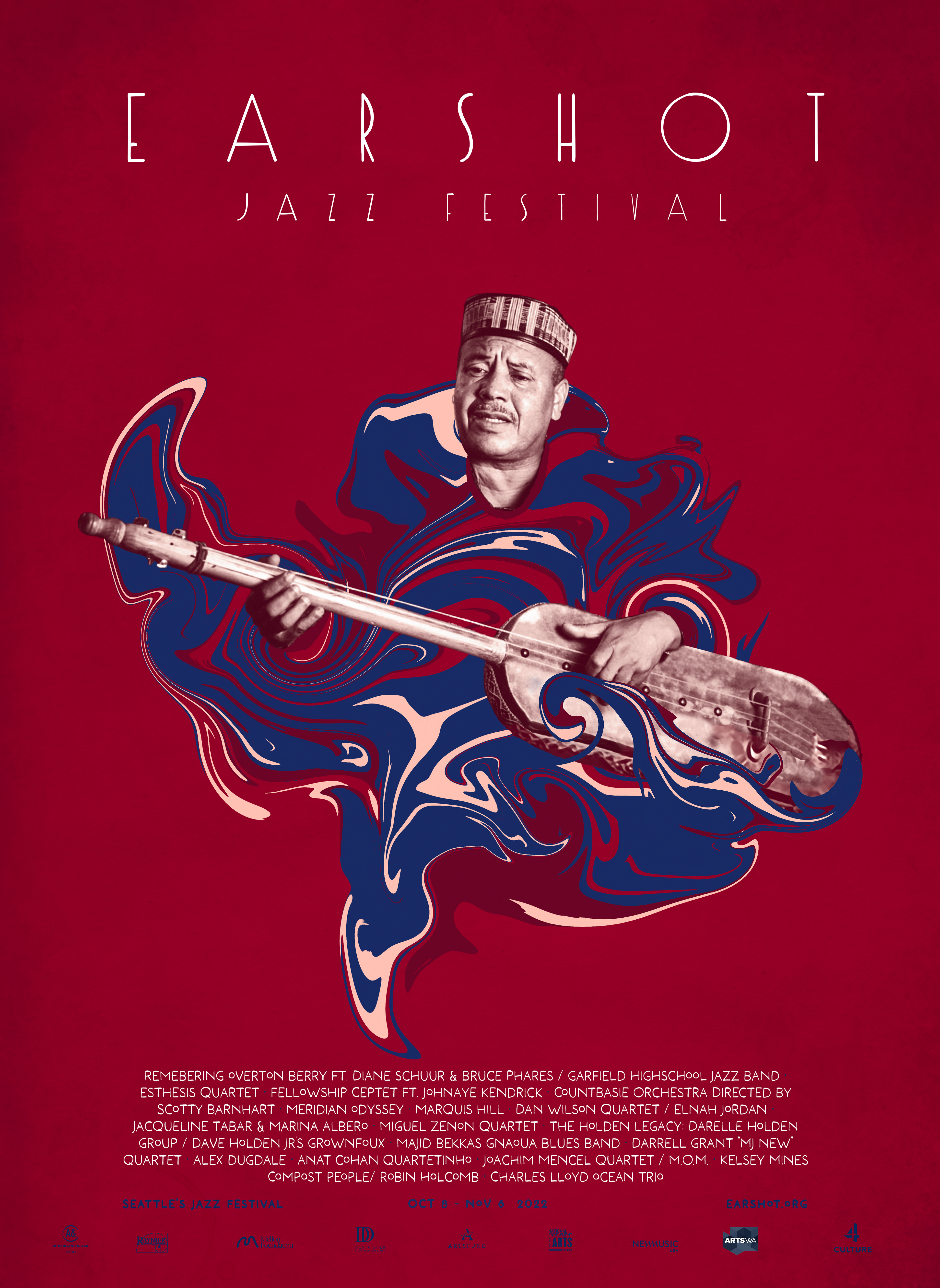
Despite being one of the longest-running and beloved music festivals in Seattle, Earshot Jazz lacks the visual brand that captures the energy, class, and excitement that going to see live jazz music can create.
The Solution
I created an attention-grabbing branded poster campaign that captures the energy of the festival and can also attract a broader audience.
Roles
Research, Concept, Layout, Visual design
Timeframe
6 weeks // 25 hours
Spring 2023
Spring 2023
Collaborators
Solo
Tools
Procreate, Sketchbook, Photoshop, InDesign
Client
School Project
• Process
Research
After doing research some research on the Earshot Jazz organization and the festival itself, I compiled all the current imagery I could find associated with the festival. This helped me identify an area of opportunity. There seemed to be very little branding and these events do not feel like they are associated with the same organization or event.
Mood board
Earshot Jazz needed some modern visuals to re-energize its visual identity so I created a mood board of visuals that I felt carried the energy I was looking to capture.
Sketches
Next, I created some thumbnail sketches and worked out some ideas
Iterations
When I zeroed in on a concept I jumped back and forth between working in Procreate and Photoshop to work through the process.




• Building the system
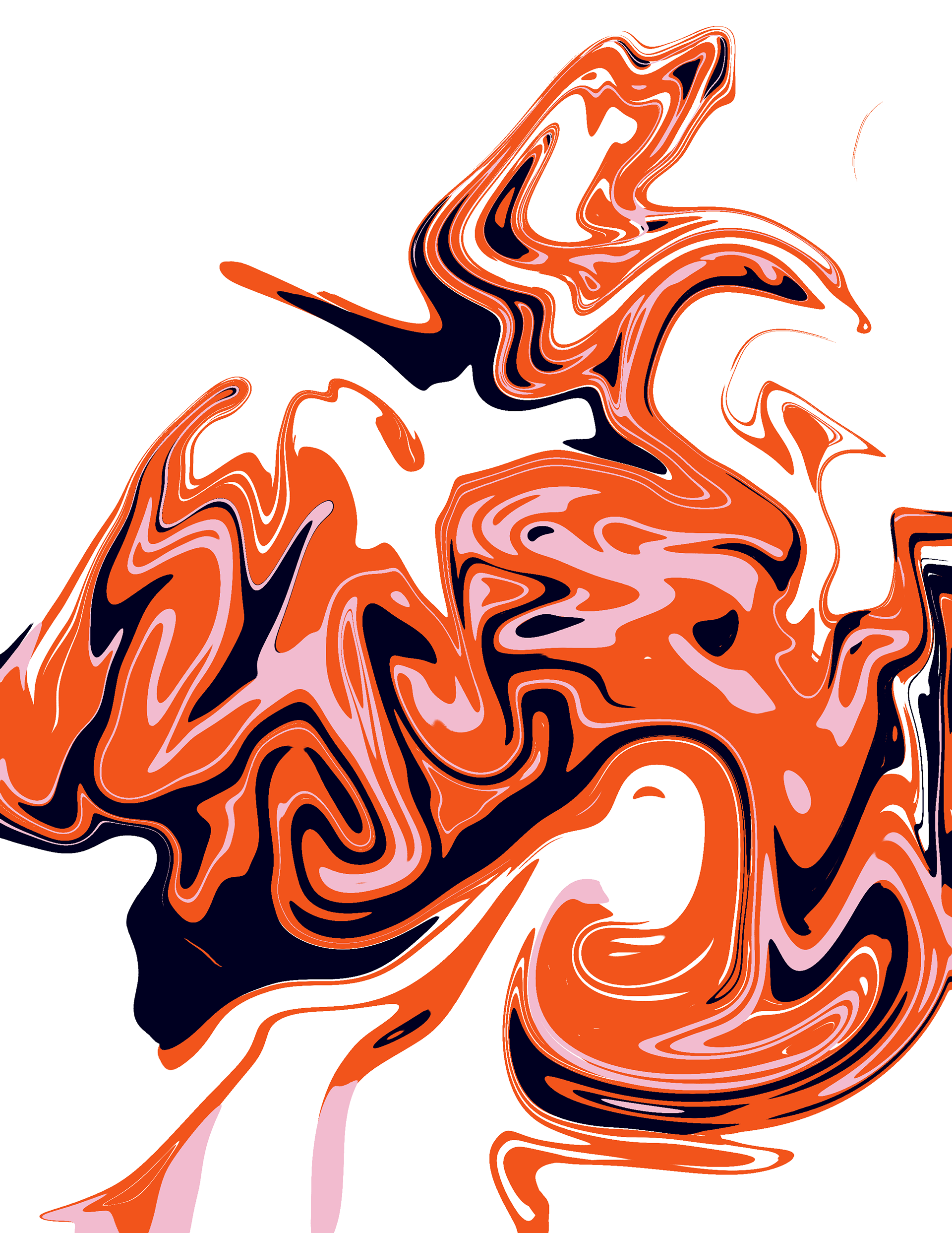
Before I could turn this into a system to apply to new designs, I first needed to deconstruct the design into its graphic elements. The elements were:
• Jazz performer
• Gradient map
• Paint swirls
• Saturated colors
Color system
When selecting colors I wanted to have variety and excitement while at the same time creating unified harmony. The navy blue and cream colors served as the "throughline" with all three designs.


Lessons and Reflections
I learned a lot about creating graphics systems and how useful they can be when expanding the scope of a project. If I was to take this further I would create a series of branded merch, and signs and apply the system to their online presence.

