• Overview
Based on the recent rise in popularity of Kombucha, many companies are rushing to market ‘Probiotic’ or ‘Prebiotic’ sodas that are naturally fermented and promise to restore or rebalance your gut. We explored alternative messaging and branding to create a unique product concept and website that could reach a new audience.
The Problem
The market is getting saturated with products offering similar benefits. How might we develop a new brand of probiotic soda that can set itself apart from the competition?
The Solution
We uncovered a gap in the market and designed a product brand and website that would reach this new audience and speak to their specific needs.
Role
Research, Concept, UX/UI, Visual Design,
Prototyping, Branding, Marketing, Content Strategy, Web Development
Prototyping, Branding, Marketing, Content Strategy, Web Development
Timeframe
9 weeks // 60 hours
Spring 2022
Spring 2022
Collaborators
Eleanor Murray
Tools
Figma, Zoom, Notion, Procreate, Photoshop, Webflow
Client
School Project
• Research
In order to understand the target audience for our probiotic kombucha drink and their motivations, we conducted extensive research on the demographics and preferences of probiotic beverage consumers. This research helped us identify key insights that informed our design decisions and branding strategy.
Existing Market Research
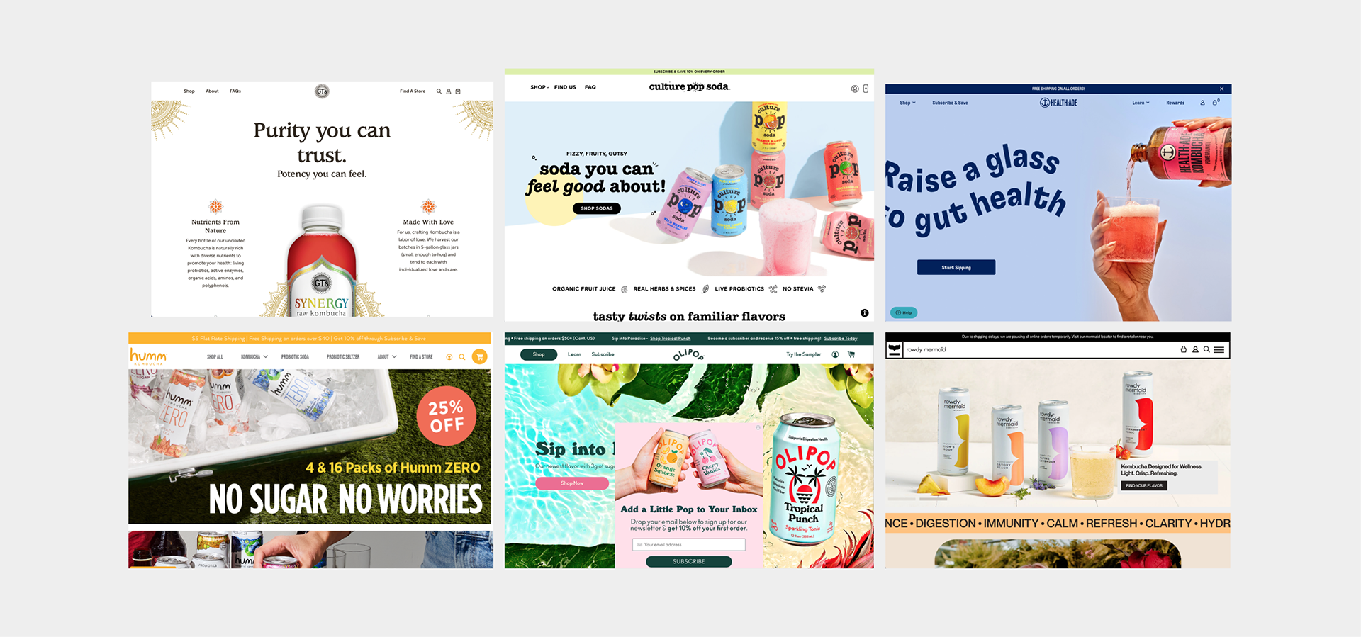
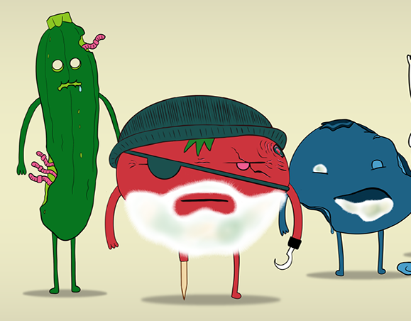
Branding
• Bright, Fun, colorful designs, almost like candy
• Fun modern or clean modern, trendy
• Feels like an alternative to a summer beer or cocktail or soda
• Minimal, large text - easy to read with short paragraphs or use of icons or illustrations
• Both GTS and OliPop have a quote from the founder or investor to build trust
• Energetic
Pros
• Not intimidating or boring
• It’s not a nutritional essay
• Really feels like a fun alternative drink to alcohol or soda
• Feels cool and fun, trendy
Cons
• Only marketed to women and young people
• Feels like it’s marketed to children
• Assumes consumers familiar with kombucha
• Trendy, so the design style might have a short shelf-life
Demographic Research
Who buys kombucha?
• Millennials
• Women
• Craft Beverage trend consumers
• Wellness trend consumers
Their motivations
• Alternative to soda and its health risks
• Alternative to alcohol
• Enhances digestive health
• Enhances skin, mood, etc
Through our research efforts, we also discovered alcohol consumption is on a 30-year steady decline. Young people are increasingly discovering the health and financial benefits of not drinking.

• Synthesis
Choosing our lane
Based on what we uncovered during the research phase we felt that there was a gap in the probiotic market; The masculine craft beer demographic. Particularly, the craft beer drinker that would like more alcohol-free alternatives

User Persona
Brad
25
Male
Male
Craft beer enthusiast that sometimes wants an alcohol-free alternative. They care about their health but still want to have something appealing to drink with their friends, after work
Beliefs
They enjoy purchasing craft products because they believe they are buying higher-value products while supporting a small business. They believe it is more traditional and authentic. They like beer but are concerned about the negative health effects and they prioritize their health. They don’t take themselves too seriously. They like humor.
Doubts
They know what kombucha is but feel it’s not for them, they don’t trust it. They think it’s too fruity or sweet. They don’t think they’ll like the taste based on the bright colorful packaging.
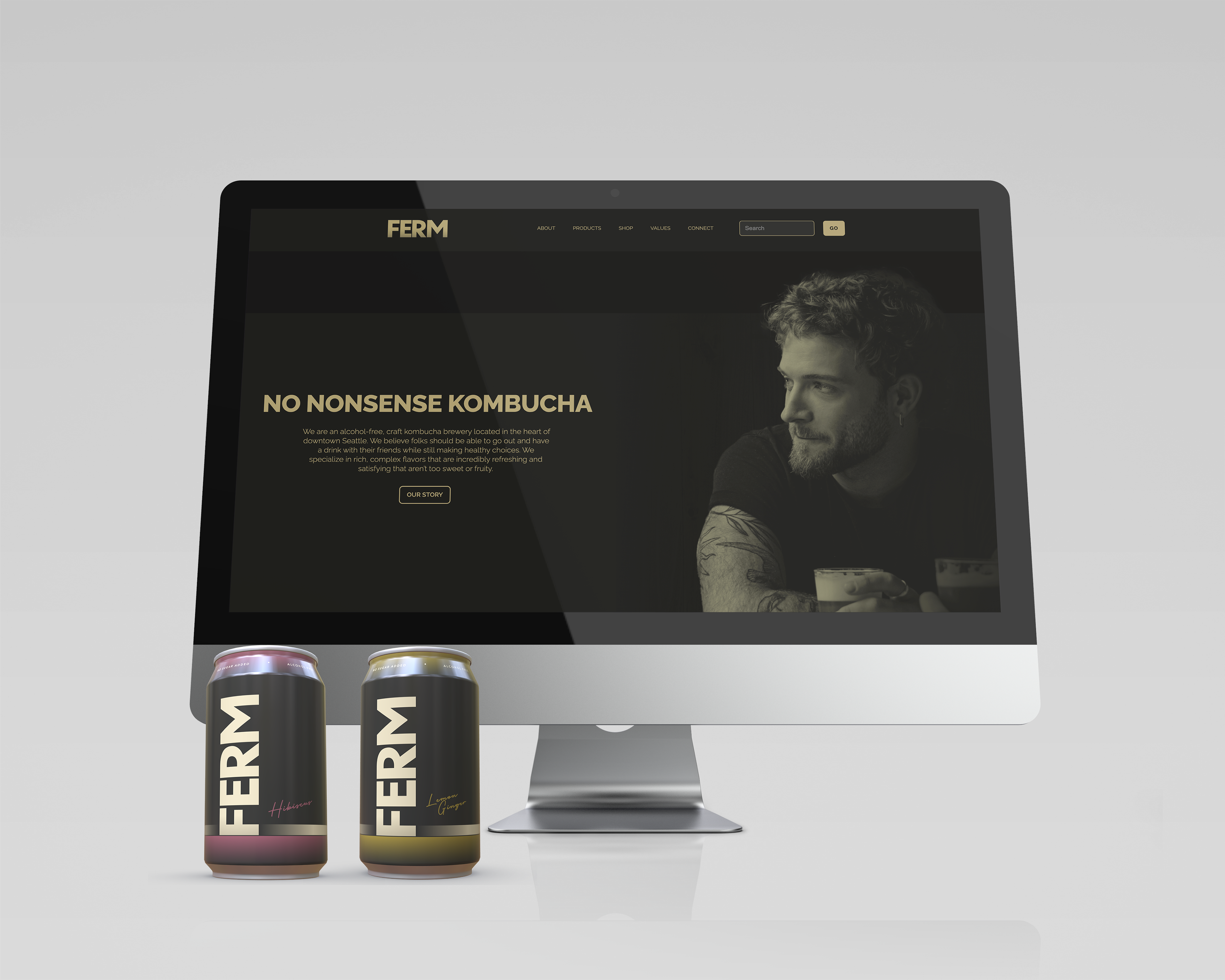
• Brand Development
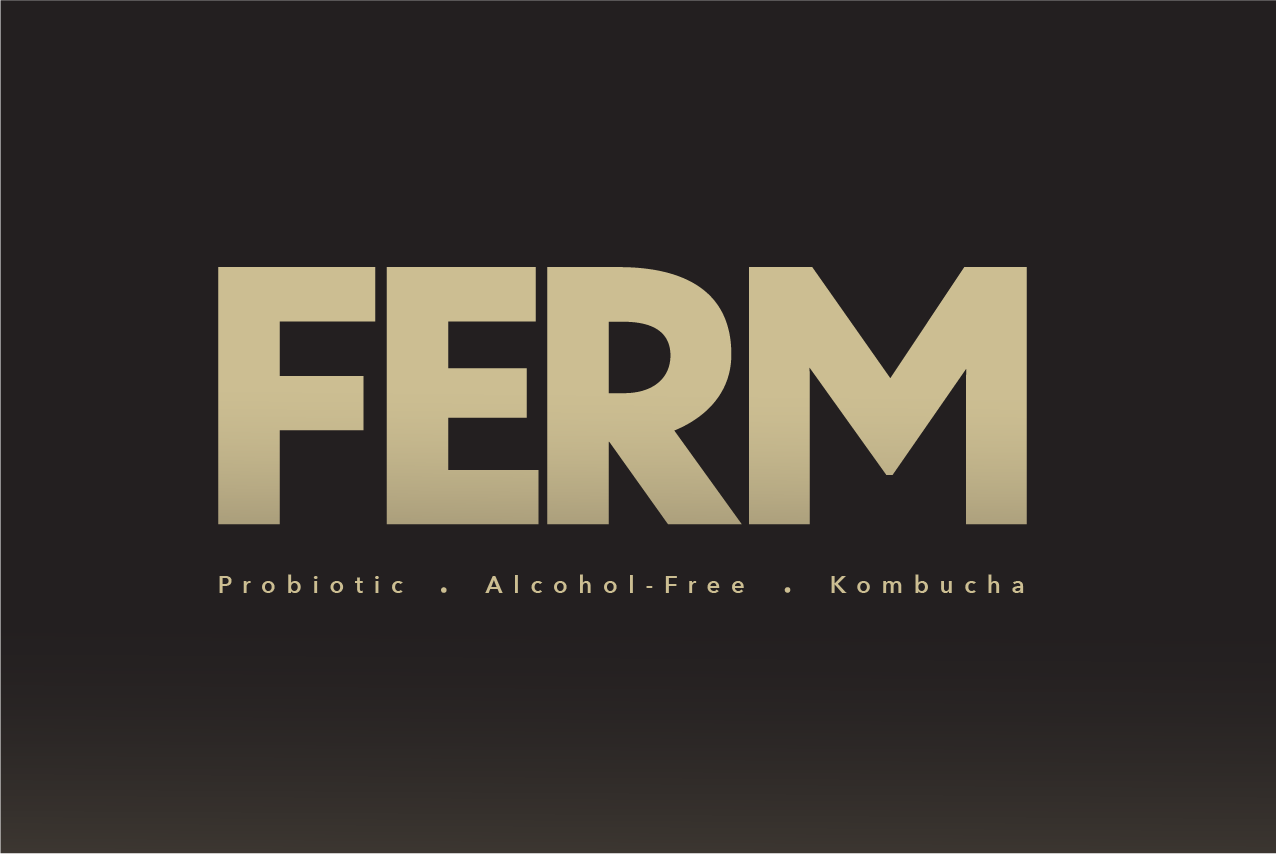
FERM: Alcohol-free kombucha
Once we had identified our target market and their motivations, we next developed what we felt were the key pillars of the brand.
Key pillars of the brand:
• We believe gut health is important to everyone
• We use rich complex flavors for a more developed taste
• We believe a rich social life doesn't have to revolve around alcohol
• We locally source our ingredients
• We believe in the local community
These pillars served as a guiding framework for our brand development, from visual design to marketing and communication.
Mission Statment
At FERM, we are dedicated to bridging the gap between health-conscious choices and enjoyable social experiences. We understand the importance of gut health in overall well-being, and we believe that everyone should have access to the benefits of probiotics without feeling restricted by their lifestyle choices. Our mission is to offer a flavorful kombucha beverage that allows you to indulge in a brew with friends while prioritizing your health. We are committed to crafting a product that strikes the perfect balance between taste and wellness, ensuring that you can make a healthy choice without compromising on flavor.
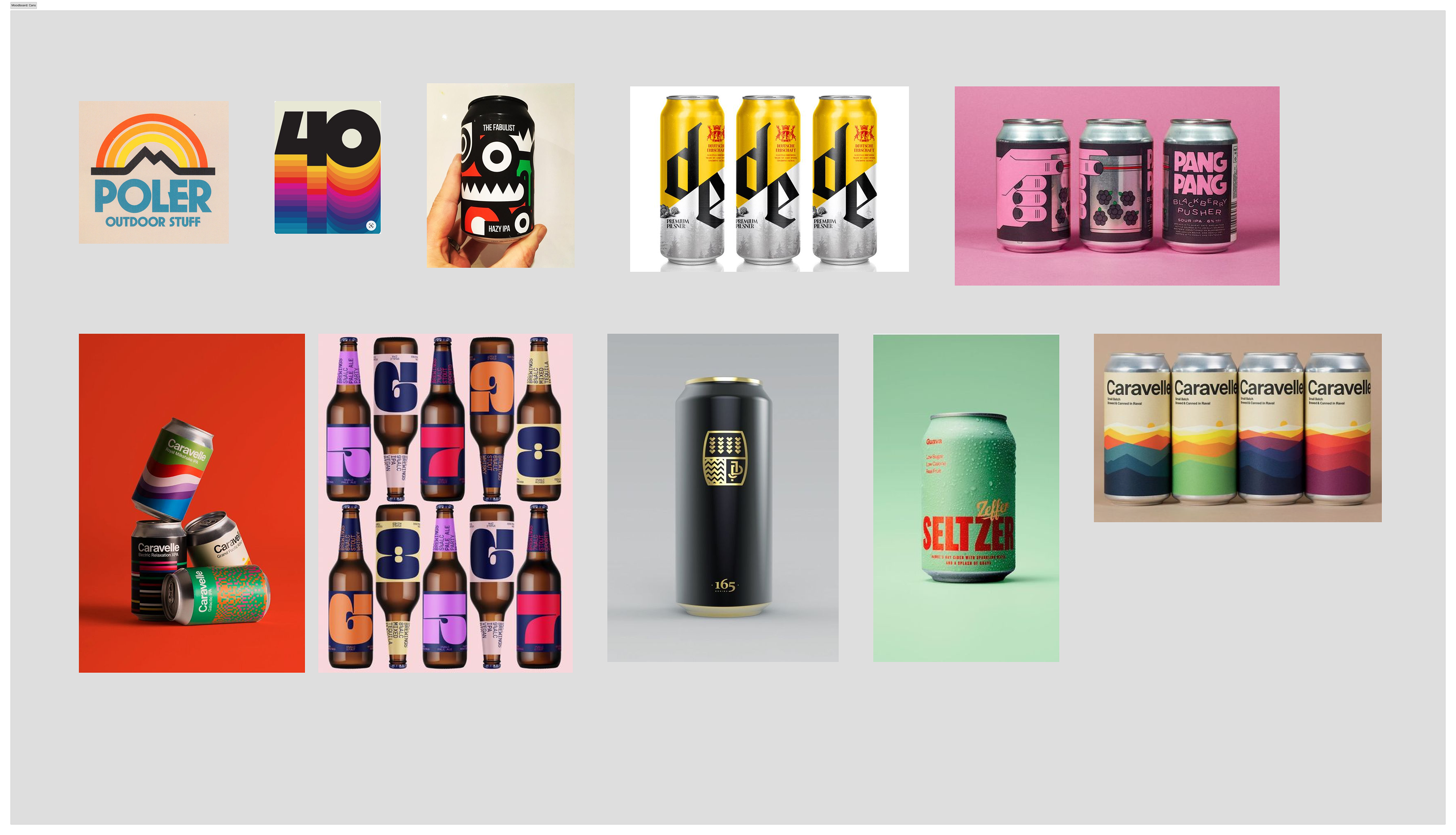
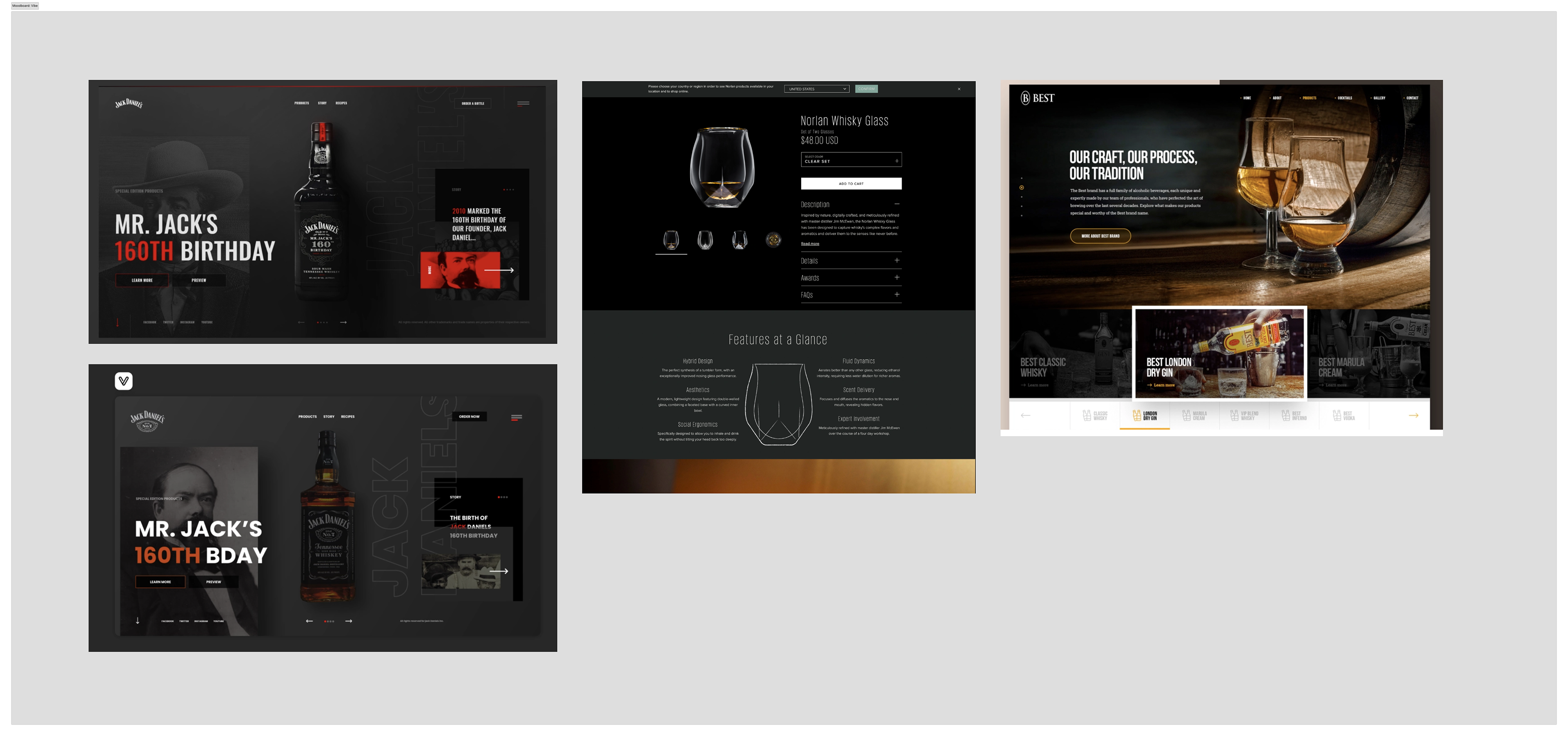
Moodboards
To establish a visual direction that aligned with our brand pillars, we created mood boards that captured our inspiration and identified existing visual and UI patterns.
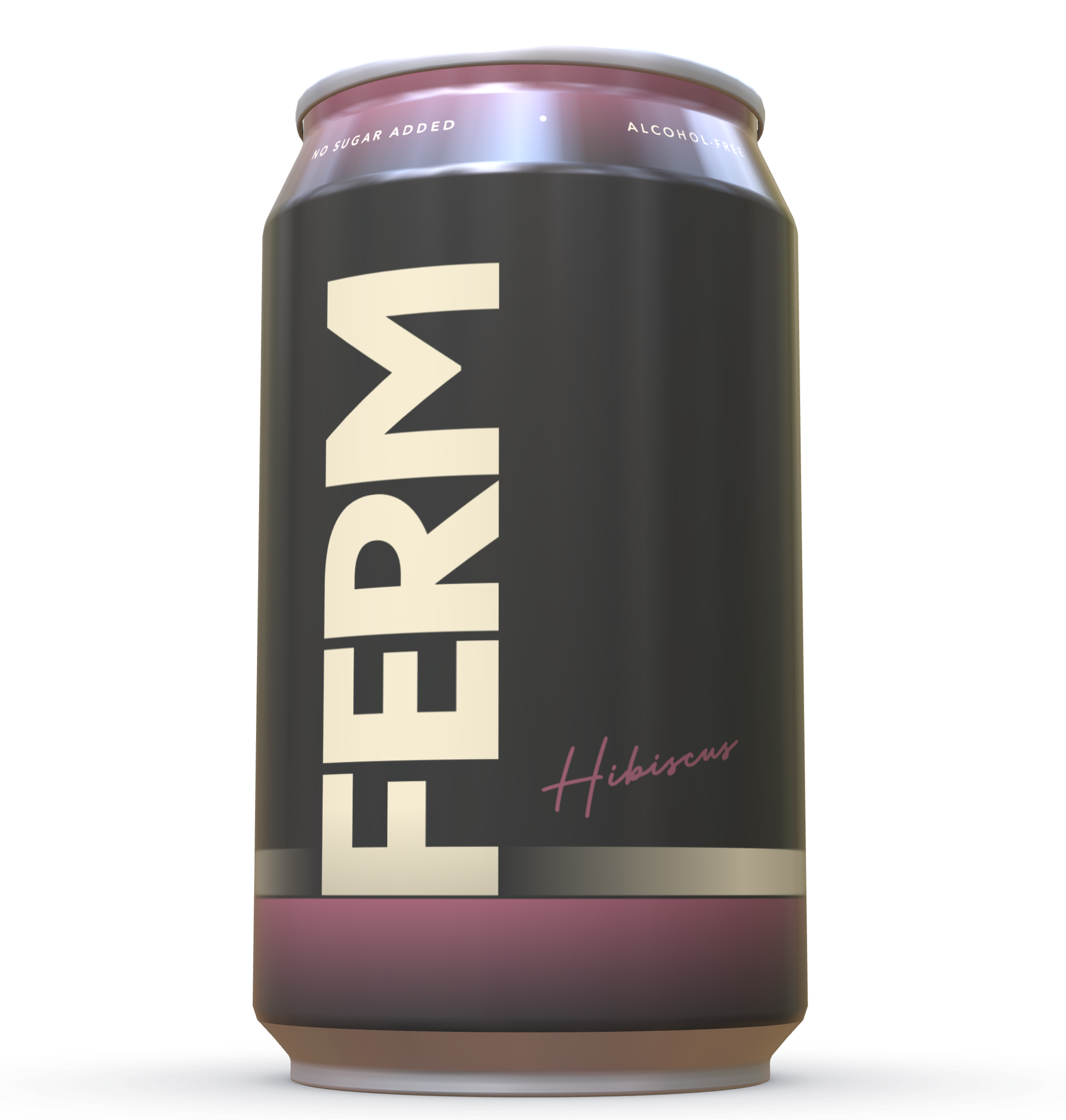
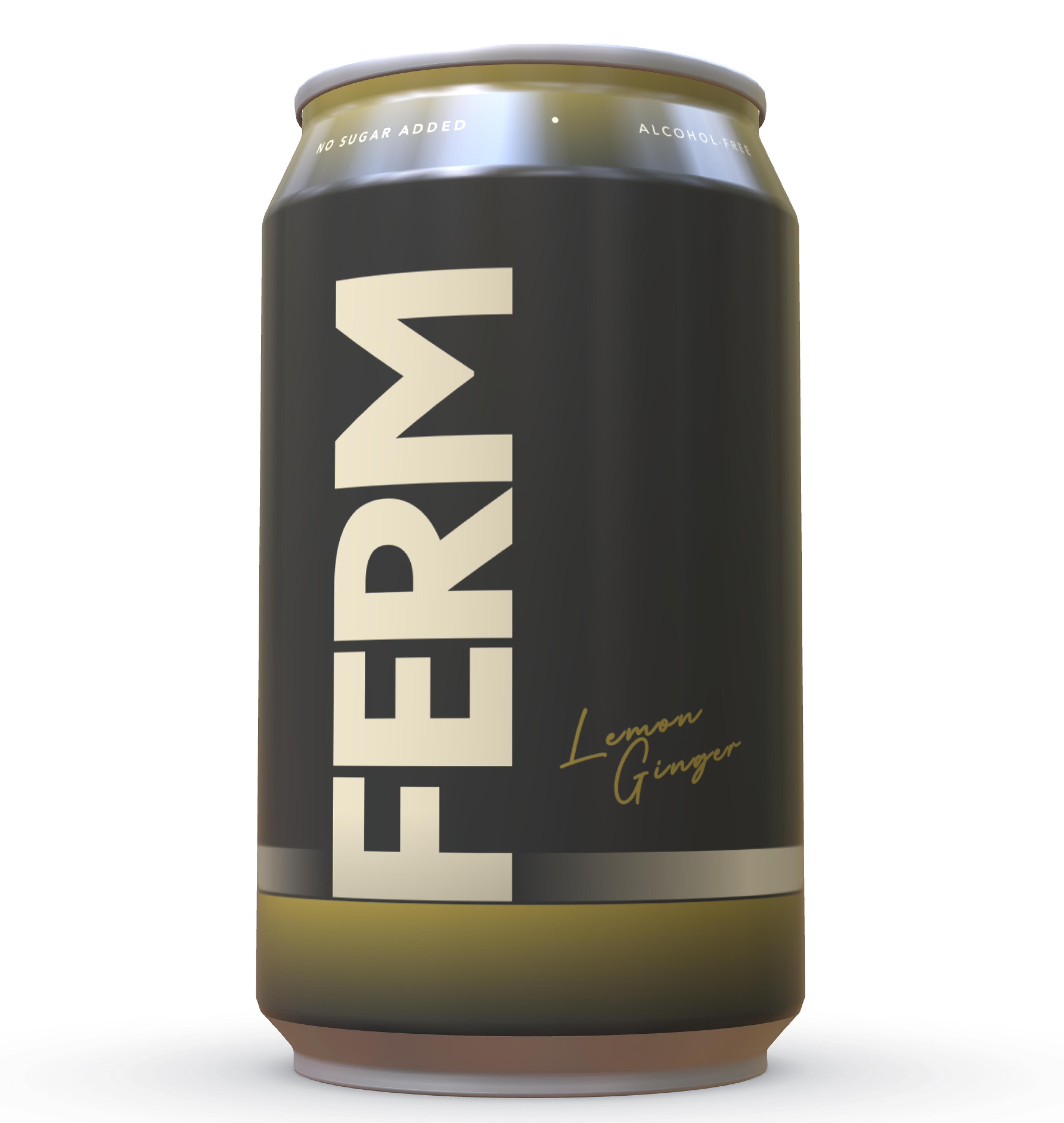
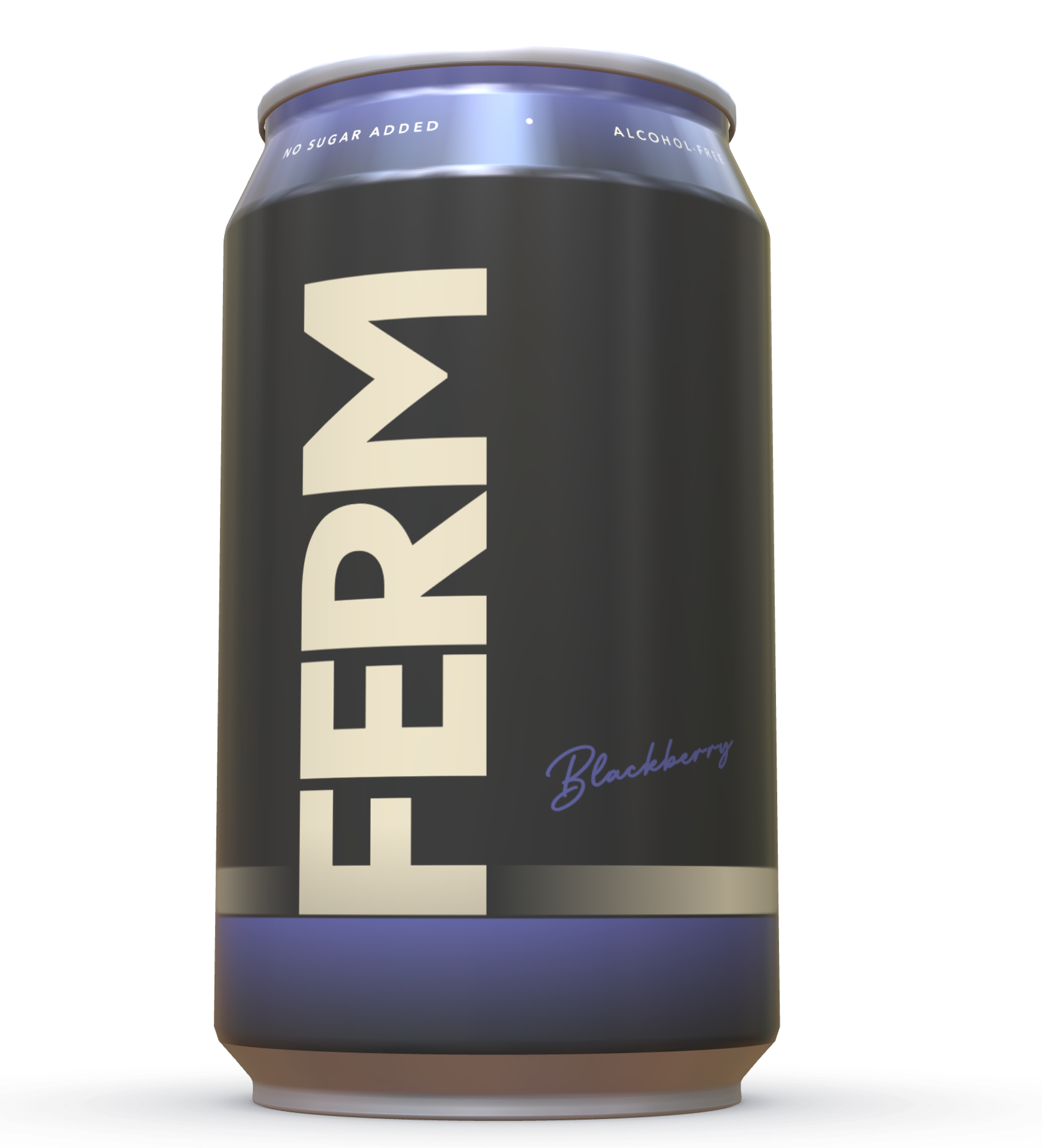
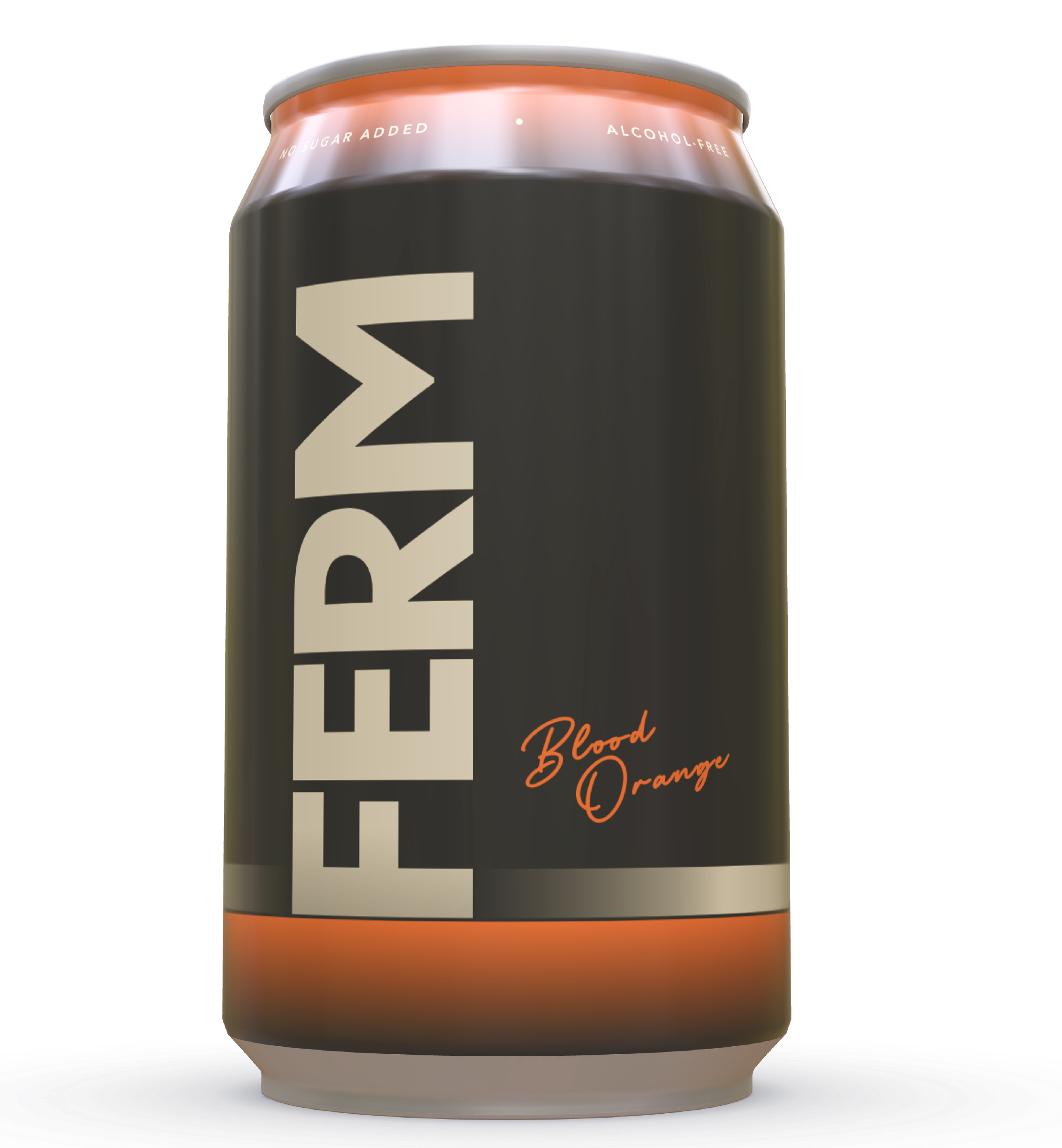
Can Design
In order to stand out in a crowded market, it's important to use a simple and straightforward design that is easy to read and understand. This might involve using bold text, short paragraphs, or visual cues like icons or illustrations to convey key information.
In order to stand out in a crowded market, it's important to use a simple and straightforward design that is easy to read and understand. This might involve using bold text, short paragraphs, or visual cues like icons or illustrations to convey key information.
Tone
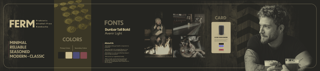
Because our goal is to build trust, we’ve designed the tone of our brand to feel minimal, reliable, seasoned, and modern-classic. We chose to go with a rich, dark color palette. Emulating that of a higher-end whiskey brand.
Because our goal is to build trust, we’ve designed the tone of our brand to feel minimal, reliable, seasoned, and modern-classic. We chose to go with a rich, dark color palette. Emulating that of a higher-end whiskey brand.
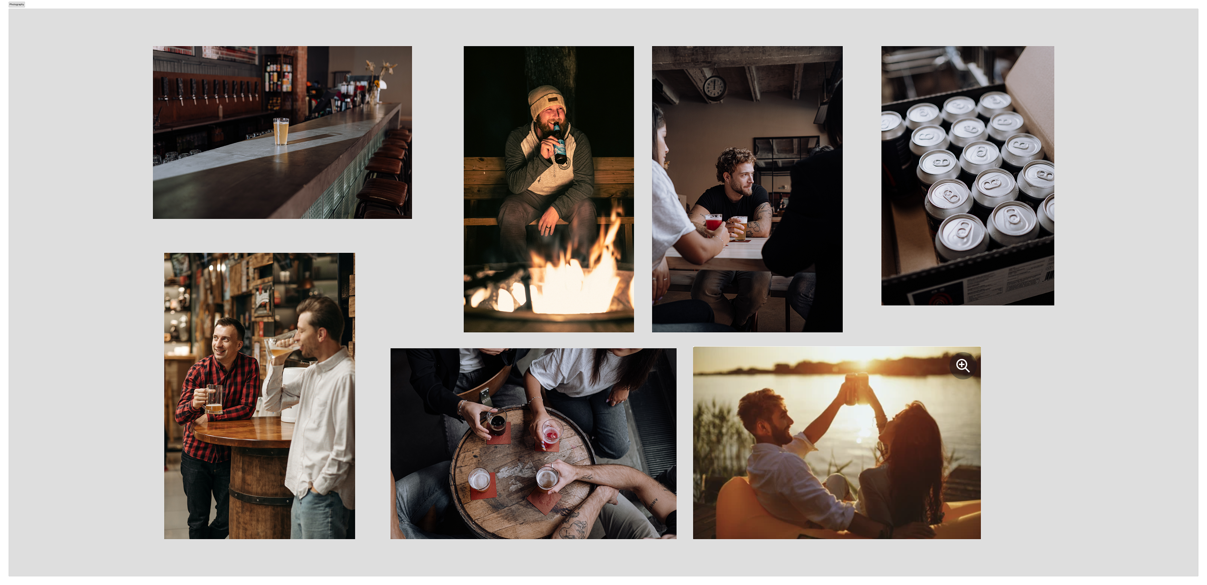
Photography
To match the brand voice we went with a classic lifestyle, craft beer tone for the photography
Color Palette
We chose black and tan as our primary colors because they are very stable and classic that provides that sense of aged and development, just like the process of fermentation. In addition, for our secondary colors, we’ve added red and a pop of purple to both grab attention and feel modern with a touch of youthfulness.

Wordmark
to communicate our modern-classic and reliable brand, we went with a simple, bold wordmark. We’ve gone with sans-serif typography for our typefaces because of its informality. it feels appropriate for having drinks after work and yet it is also very solid and bold in its foundation which invites trust.
Stylescape
After landing on a visual direction for our brand, we built a style scape to see all of our brand elements working together.
Can Design
We applied the brand to the can design.
Social Media Marketing
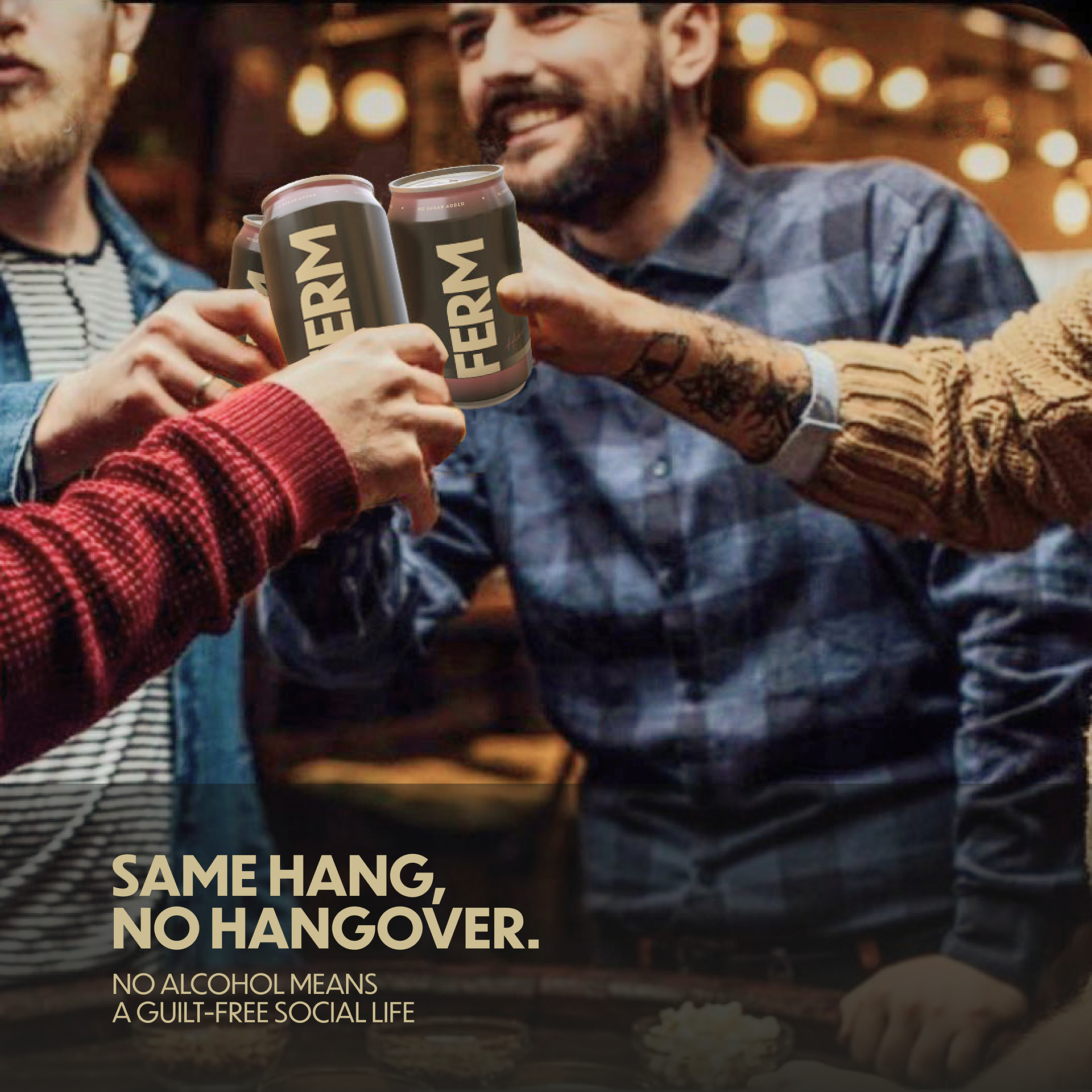
We created a series of branded social media marking assets. Each post was speaking to a different value of our target user.
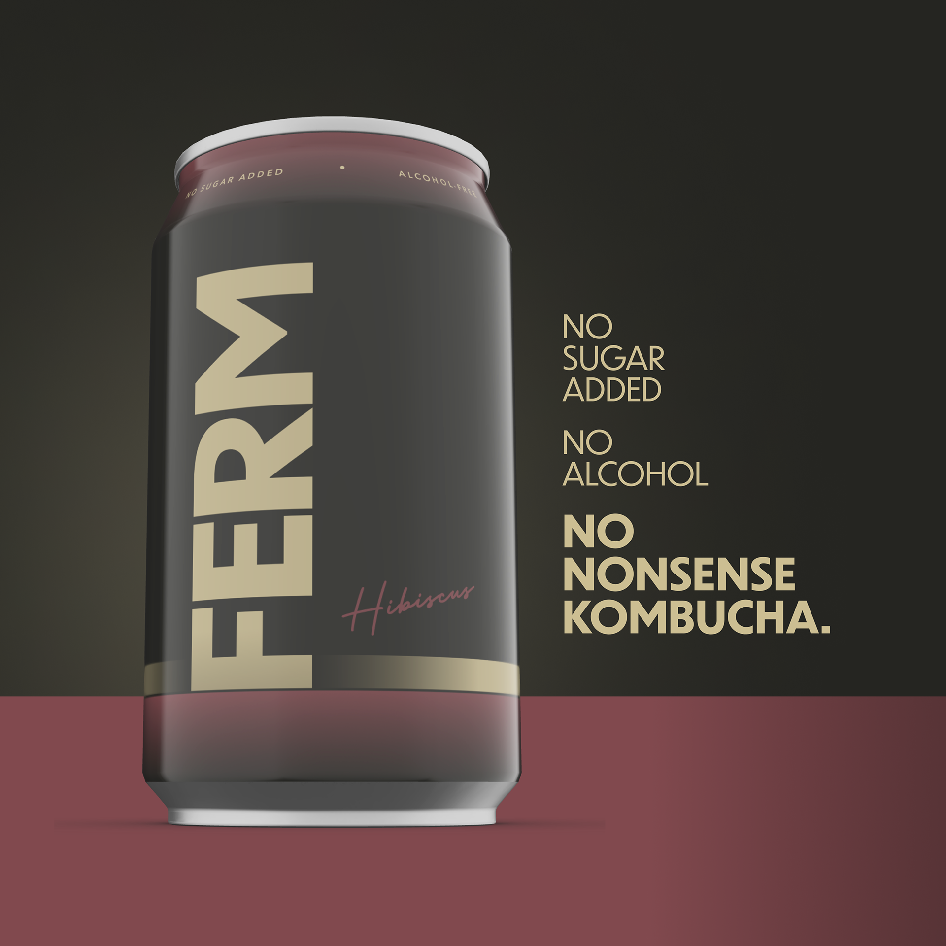
In this post, we are building trust with the user about Kombucha by using a simple, catchy headline while featuring our product that resembles more of the craft beer aesthetic.
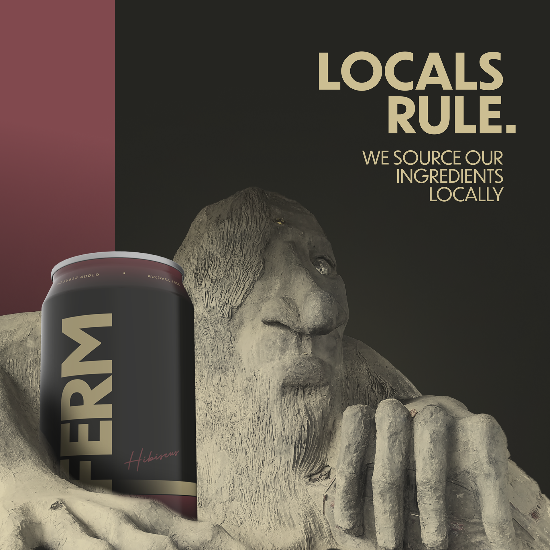
Since our user is a millennial that likes supporting local businesses, in this post we’ve featured a local attraction to form that bond between our product and Seattle
Here we are connecting to the user’s desire to have a drink after work with friends. This is to show them they can still have that experience without alcohol.

This post speaks to the craft brewing interests of our users by showing them the similarity between brewed kombucha and beer by serving it through a tap.
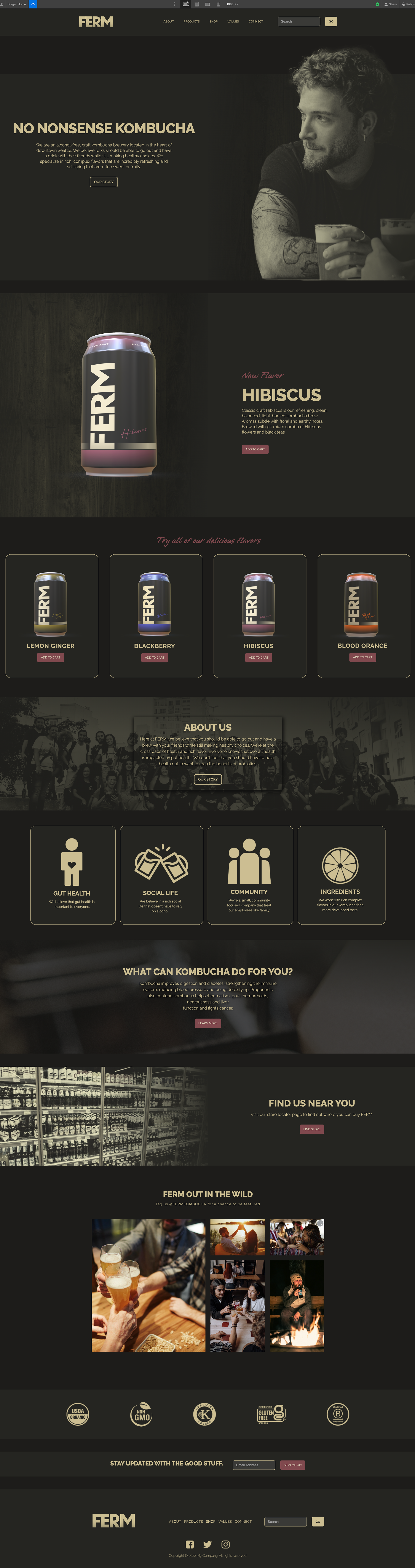
• Website
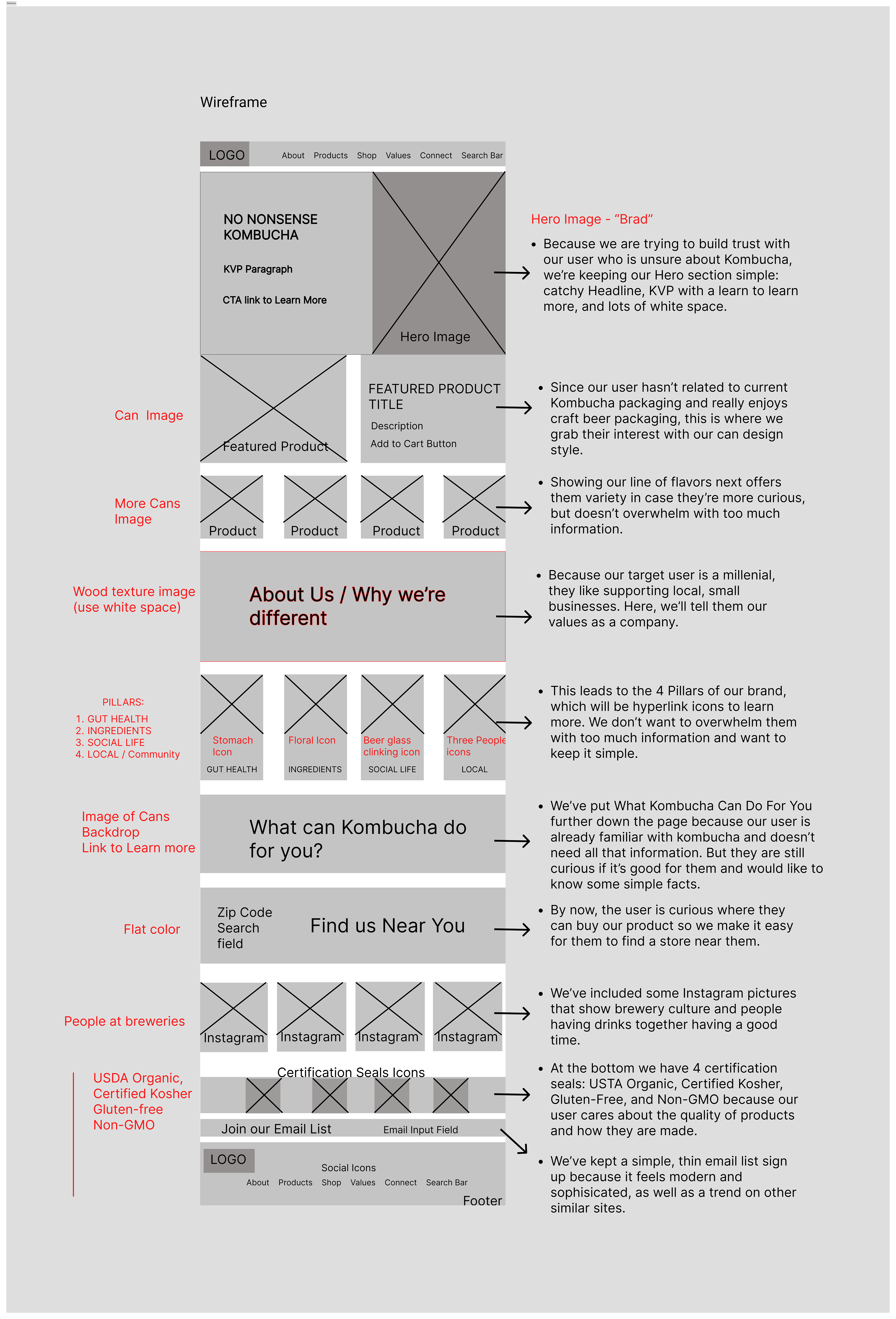
Low-fi website wireframe
Before we could move into Webflow we built a low-fi wireframe of the website in Figma.
Hi-fi Website Prototype
We took our Figma prototype and built the website using Webflow.
Final thoughts
We created a brand and website experience that addressed the user's key value propositions and pain points at every stage of the design process. This allowed us to create a brand that visually aligns with our target persona and differentiated itself from the competition.